SORBUS spotlight: The Least Crumpled Shirt in the Laundry Basket
The global economy, or at least the advanced economies, have not had an especially good two decades. The financial crisis of 2007-2009, the Eurozone crisis of 2010-2013, the Greek crisis of 2015, the Brexit shock in 2016, the pandemic in 2020-21 and the energy price spike of 2021-2023 have all left their marks. Even in between these acute moments of extreme tension, growth has generally been at best soggy. The United States has performed somewhat better than its North Atlantic Peers but, even there, growth in the 2010s and 2020s so far has weakened compared to the late 1990s or 2000s.
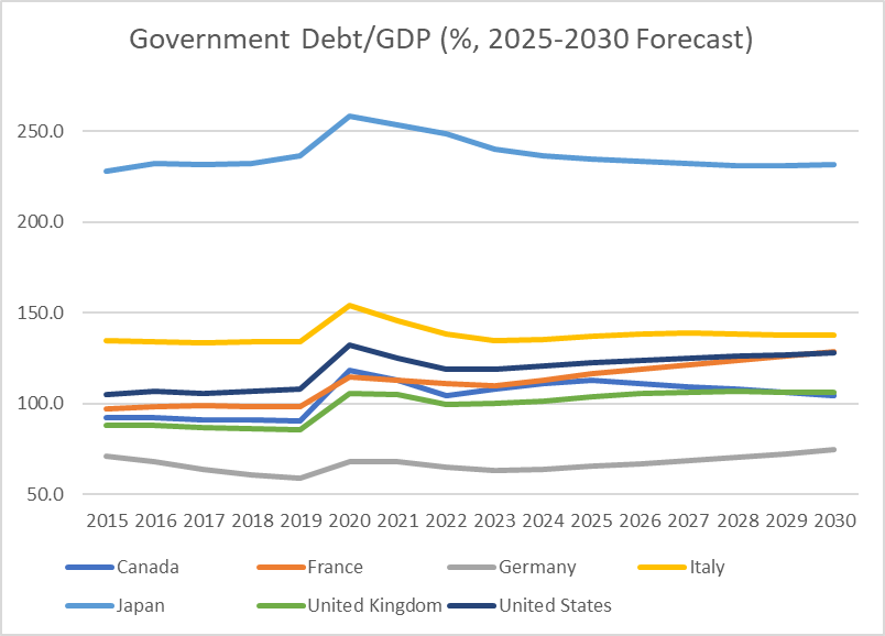
The most enduring legacy of these two weak decades can be seen in elevated levels of government debt/GDP. The broad pattern since 2007 has been that debt ratios spike higher in a crisis and stay high afterwards.
source: SORBUS PARTNERS LLP, IMF (data as at: 19/08/2025)
The above chart takes its numbers from the International Monetary Fund’s Fiscal Monitor, published this Spring. The ratios for 2025-2030 all represent forecasts.
Japan’s debt levels, as they have been since the 1990s, remain stratospherically high and Germany’s – where fiscal policy has been excessively tight since 2009 – remain lower but for most of the G7 group of advanced economies, debt to GDP ratios are around the 100%-ish mark and expected to remain there over the rest of this decade.
Such debt levels are very unusual outside of a major war. US debt to GDP, for example, peaked at over 106% in the 1940s – a level it is now expected to breach in the coming years.
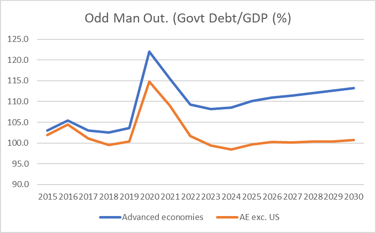
The big picture though misses an important nuance, one brought out clearly by the chart below.
source: SORBUS PARTNERS LLP, IMF (data as at: 19/08/2025)
This shows the debt ratio of all advanced economies in aggregate and the same category minus the United States.
Taken together the advanced economies excluding the United States have at least broadly stabilised their debt ratio, albeit at a high level. The upwards trend on the wider category is driven by developments in Washington DC.
Of course headline debt numbers only tell part of the story. The annual deficit numbers offer an important clue as to the drivers of change.
source: SORBUS PARTNERS LLP, IMF (data as at: 19/08/2025)
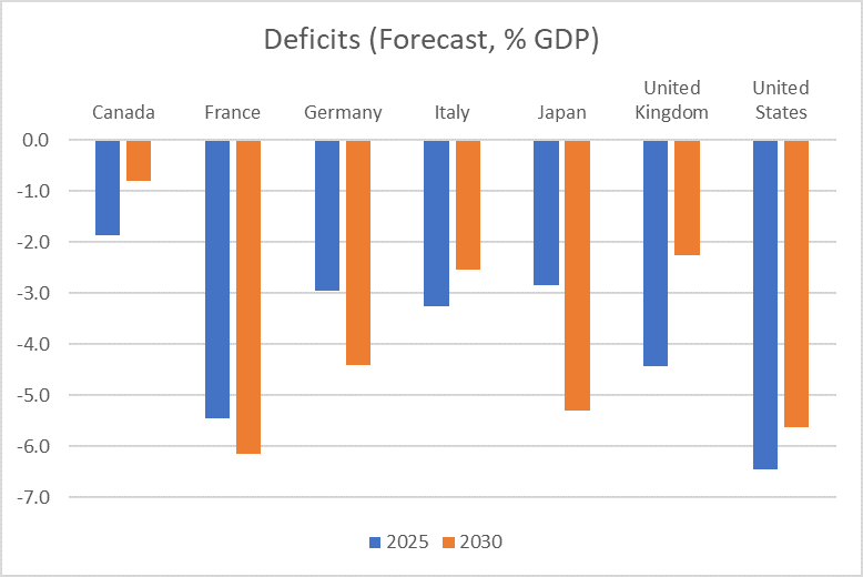
Sticking to the comparable IMF numbers, the chart above shows the projected annual deficits across the G7 this year and in 2030.
A few points leap out. Firstly, the US is already running a very large deficit – almost a record one for the country in peacetime – and is expected to make little progress towards closing it over the coming half decade. Billions of dollars of new revenue – collected via tariffs – are likely to be outweighed by tax cuts.
Japan and France are both expected to see their deficits widen, mostly due to ongoing demographic change. An aging population will push pension and health spending up whilst weighing on revenues as the working age share of the population falls.
The widening German deficit also reflects demographic factors but, in this case, a conscious policy decision to increase borrowing by around one trillion euros over the coming decade for rearmament and infrastructure spending.
Britain and Canada are forecast to see notably falling deficits following steep tax rises.
Italy, with debt to GDP around 130% and long regarded as something of a spendthrift nation, is also expected to show some progress. That might surprise some observers but it should not. By one important measure, Italy has long had some of the soundest public finances in Europe.
source: SORBUS PARTNERS LLP, IMF (data as at: 19/08/2025)
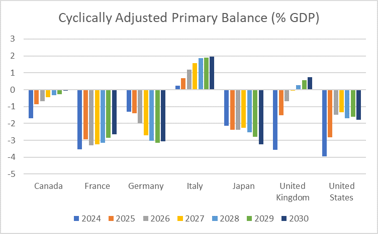
The above chart – again constructed using IMF data – takes more explaining. The measure shown is the cyclically adjusted primary deficit or surplus. Cyclically adjusted, in this case, refers to adjusting the raw numbers for where an economy is in the economic cycle.
If an economy is undergoing an unsustainable boom then one might expect the government’s coffers to be unusually full as revenues flow in. Equally, during a recession welfare spending will be pushed up by higher unemployment and tax revenues will lag as profits and wage growth weaken. This measure attempts to strip those effects by estimating what tax revenues and spending levels would be – on current policy – if the economy was operating at potential. Of course such measures are also uncertain and estimating what potential output is exactly is never straightforward. But these IMF numbers at least have the benefit of being consistent across the major economies.
What is more, this measure is looking at the primary deficit or surplus rather than the headline figure – this is a measure which excludes interest payments on existing debt.
Caveats aside, the results are rather striking.
Italy, by this measure, looks rather solid – with a consistent primary surplus. Of course, the fact that Italy does have to pay interest on a debt burden of circa 130% of GDP pushes the other way.
The relative tightness of planned British fiscal policy is also clearly illustrated.
Of course whilst a measure excluding interest payments is a useful exercise, debt does have to be serviced. And the rise in service costs has been the major factor in changing the outlook for public finances since the pandemic.
Whilst the point is obvious, it is all too often forgotten in the political debate that when it comes to a debt burden two things matter: the level of the debt and the interest rate being charged on it. A £100,000 debt that attracts an interest rate of 1% will ‘burden’ a borrower with servicing payments of £1,000 a year. But a debt of just £50,000 that is charged at 5% a year will result in annual servicing payments of £2,500.
This simple fact explains one of the oddities of the 2010s as a whole. The financial crisis of 2007-09 had two impacts on the public finances. On the one hand, tax revenues fell off a cliff and the state found itself being asked to recapitalise failing institutions; Taken together that meant a material increase in the level of debt. On the other hand, interest rates collapsed as central banks sought to fend off recession.
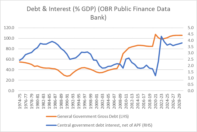
In most cases the second of these factors outweighed the first. Take the UK as an example.
source: SORBUS PARTNERS LLP, IMF (data as at: 19/08/2025)
Whilst the level of debt in the 2010s was around twice as high as that of the 2000s the actual cost of servicing it annually fell compared to the decade before. Indeed the British government spent less on debt service in the 2010s than it did in the 2000s, 1990s or 1980s, despite a much larger level of debt.
The big change since the pandemic was not just a higher level of debt (with the furlough scheme and energy price guarantee pushing debt up from around 80% to closer to 100%) but a much larger change in interest rates – from under 1% to over 4%. Historically low interest rates cushioned and counteracted a much higher level of debt throughout the 2010s; the actual burden of managing the debt fell. But a much higher level of debt coupled with higher interest rates is a very different matter.
All things being equal, a higher level of debt increases economic fragilities and leaves the government more exposed to changes in interest rates. Since 2021 that potential risk has catalysed into a nasty shock. The government is expected to spend 3.7% of national income on debt service this financial year compared to 1.7% in the last full financial year, 2019/20, before the pandemic.
In other words, two percent of national income has to be found from either cutting other types of spending or raising taxes just to stand still. Around one in twelve pounds that the government spends now goes towards servicing the debt. This is the uncomfortable fiscal maths bedevilling the British government and many of its peers. Even in countries which are making progress in bringing primary – excluding interest – budgets back towards balance, mounting interest costs are pushing in the other direction.
Still, none of these fiscal pressures, high debt levels or still wide (in many cases) deficits should be looked at in isolation. For international investors looking for sovereign bond exposure, picking the bonds to buy is sometimes a little like taking the least crumpled shirt out of the laundry basket – an exercise in choosing the least worst rather than the best.
Italy for example might have a high debt ratio at around 130% but it has at least managed to run a relatively tight fiscal policy for years in order to stabilise debt at those levels. German deficits might be expanding and debt levels rising but much of that reflects a deliberate policy choice and the overall level of debt remains comparatively low. Britain might be saddled with a high debt and rising interest costs but looked to be at least improving the underlying fiscal position. France and Japan, with high and rising debt and widening deficits, look – out of the entire G7 to be the most crumpled shirts. The least crumpled is very much in the eye of the beholder.
|
What we are watching. BOE Mortgage Approvals, 1st September – UK consumer confidence looks to have perked up a little in recent months, driven no doubt by lower mortgage rates and lower fuel prices. Mortgage approvals are one of the best short-term indicators of consumer spending. The figures for July should give an early sign as to whether the improved confidence is feeding through into actual spending. ISM Prices Paid, 3rd September – The ISM surveys of US business are a useful monthly snapshot of business confidence and mood. The figures for ‘prices paid’ released in early September will be an important early sign of how the new tariffs, mostly in place by August following a 90 day pause, are feeding through into inflation. |
